Friday, February 28, 2014

Old Man


This project was a fairly easy assignment, there were times that following along with the tutorial was kind of hard, but overall, it was easy and I really enjoyed it. The main tool in this project was just working with layers and blending them together and using new blending modes and opacities and brushes to make it all work together and achieve the look I was aiming for. Also I had never used high pass before so it was cool to learn to use that new filter and see what you could do with it using different blending modes.

Thursday, February 27, 2014

Vintage Poster


Overall I didn't really like this project very much. It took me a few days and I struggled with certain steps and I just don't really care for the look of the final product. However, this project did allow me to use new tools I had never used before and help with my understanding of how to use certain tools. This assignment required me to use the layers panel a lot which is good for me because often times I forget to think about the layers panel and that leaves me in a mess at the end. Also this project used a lot of text and blending modes and those are always fun to use and add a new effect to the picture.

Monday, February 24, 2014

Text Modification 2

http://www.adobetutorialz.com/articles/30970817/1/create-happy-new-year-2012-colorful-greeting-card-photoshop-cs


This assignment was not necessarily hard, but it was really time consuming and took me 5 class days to complete because making all the different circles took a lot of time. Most of this project required me to use layer styles to adjust the color and different gradients of the circle. I like the overall look of this project and how colorful and bubbly is. However, if I could go back and choose a different tutorial to follow, I think I would just because creating all the circles and choosing the correct gradient styles took alot of time. But I do like this assignment and am happy with how it turned out!

Tuesday, February 18, 2014

Graffiti Text Modification


This assignment was probably one of the easiest ones I've done all year, and the tutorial was very easy to follow. I liked the video tutorial because it made it easy to follow along and not get lost. The beginning of this project required me to make a displacement map which wasn't difficult since we have done that before. For the actual text style, I used the layer styles panel to make adjustments which wasn't difficult either. I used gradient overlay, outer glow, inner shadow, and stroke. The only part of this project that I had never done before was the "blend if" option, but it was easy to use and the tutorial showed how to use it really well. Overall I liked this projec, but in hindsight I wish I would have made the text a little larger.

Friday, February 14, 2014

Movie Poster 2


I actually really enjoyed this project because I was able to take it my own way and be really creative. I didn't use a tutorial at all on this so it forced me to learn what certain tools did on my own until I got the look I wanted. I mainly just adjusted the brightness level for the leaves, but I adjusted the hue and saturation on a few of the leaves to blend into the picture better. Also, I used gaussian blur and motion blur on the leaves just depending on which leaf I was working on and how I wanted that particular one to look. I chose to use red leaves because they contrasted well with the picture and related well to the "Whirlwind" title.

Friday, February 7, 2014

Movie Poster


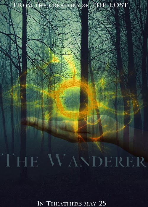
For this assignment, I designed something I wouldn't typically design. I chose to use a forest background to give a sort of dark, creepy look without being too scary. Creating the actual ball that is in the hand, was probably the hardest part of this assignment, but wasn't too challenging. It was hard because I had to use some tools I had never used before. For me, I think the most difficult part of creating the ball was using the twirl clockwise tool simply because I had to choose the settings for that tool and it took me a while to choose the settings I liked. Also positioning the hand and choosing the opacity level I wanted was difficult as well just because there are so many options and ways I could make it look. Overall, I wanted to give this poster a semi scary look, not that I would ever watch a movie like this because scary movies are not my thing, but I think the final look of the poster turned out well.

Tuesday, February 4, 2014

Brush Composition


This assignment had some tough parts, but was overall pretty easy and enjoyable. I chose to use Orlando because I have loved him ever since I was little so using him in my assignment was a must. The first step of this project was to use the pen tool to select the person, which honestly was one of the hardest steps since the pen tool can be challenging to work with. Next we created a new layer and changed the blending mode and then used the dodge and burn tools to emphasize certain dark and light spots on our subject. The dodge and burn tools were easy to use and added a nice effect to Orlando. Then we picked a color and background to blend our character into and I chose a brown forest to give kind of a dark manly look but also be appealing to the eye. Next, we used a picture of the northern lights to cutout and blend into the background. Blending this into the background was easy, but took time to go through all the different blending modes and play with the hue and saturation to see what looked best for my particular photo.

Brushes


This project was created by using different brushes in photoshop. While creating this, I was mainly focusing on the different types of brushes and what each one looked like. This piece of course isn't pretty or something I would give a client but it allowed me to practice with the brushes. To make the clouds, I adjusted the opacity to make some a little darker than others. For the tree, I used the leave tool and attempted to give it the look that summer was changing to fall.