Friday, February 7, 2014
Movie Poster
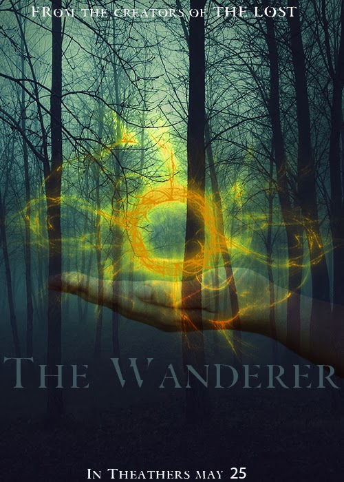
For this assignment, I designed something I wouldn't typically design. I chose to use a forest background to give a sort of dark, creepy look without being too scary. Creating the actual ball that is in the hand, was probably the hardest part of this assignment, but wasn't too challenging. It was hard because I had to use some tools I had never used before. For me, I think the most difficult part of creating the ball was using the twirl clockwise tool simply because I had to choose the settings for that tool and it took me a while to choose the settings I liked. Also positioning the hand and choosing the opacity level I wanted was difficult as well just because there are so many options and ways I could make it look. Overall, I wanted to give this poster a semi scary look, not that I would ever watch a movie like this because scary movies are not my thing, but I think the final look of the poster turned out well.
Subscribe to:
Post Comments (Atom)

No comments:
Post a Comment